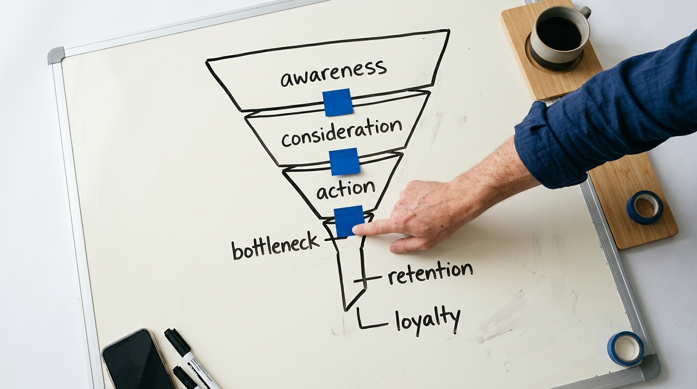
A low-converting website is a critical business liability. It signals a fundamental disconnect between what your site offers and what your visitors expect, resulting in lost leads and wasted marketing spend. Diagnosing the root cause requires a systematic Conversion Rate Optimization (CRO) audit.
The core objective of a CRO audit is to identify friction points in the user journey and implement data-driven changes to improve the percentage of visitors who complete a desired action, such as filling out a form, making a purchase, or booking an appointment. For service businesses, this process is the engine of lead generation and directly impacts bottom-line revenue. This 25-point checklist provides a structured framework for auditing your website and developing a strategic plan to boost its performance.
The CRO Audit Framework: 4 Pillars of Conversion
A comprehensive CRO audit examines your website through four critical lenses. Weakness in any one area can derail the entire user journey. Before diving into the checklist, understand these pillars:
- Clarity & Value Proposition: Does the user immediately understand what you do, who you do it for, and why they should choose you? This is the foundation of trust and engagement.
- User Experience (UX) & Navigation: Can users find what they need easily and intuitively? A frustrating experience is the fastest way to lose a potential lead.
- Trust & Credibility: Does your website project professionalism and authority? Visitors must believe your claims and feel secure providing their information.
- Calls-to-Action (CTAs) & Friction: Is it obvious what the user should do next, and is the process of doing so as seamless as possible? Any unnecessary step or confusing instruction creates friction that kills conversions.
The 25-Point Website CRO Audit Checklist
Use this checklist to systematically evaluate your key pages, including your homepage, primary service pages, and any dedicated landing pages for paid campaigns. Document your findings to build a prioritized action plan.
Pillar 1: Clarity & Value Proposition
First impressions are formed in seconds. If a visitor is confused, they will leave. Your value proposition must be instantly comprehensible.
- Headline Clarity (The 5-Second Test): Can a new visitor understand what your business offers within five seconds of landing on the page? Your primary headline should clearly state the service, the target audience, and the key benefit. Avoid vague jargon like "Synergistic Business Solutions." Instead, use direct language: "24/7 Emergency Plumbing for Homeowners in Dallas."
- Sub-headline Support: Does the sub-headline expand on the main headline, providing additional context or a secondary benefit? It should overcome a key objection or elaborate on the primary promise. Example: "Licensed, Insured, and On-Site in 60 Minutes or Less."
- Unique Selling Proposition (USP) Prominence: Is your core differentiator clearly articulated above the fold? Whether it's a satisfaction guarantee, industry-leading response time, or specialized expertise (e.g., "Board-Certified Family Law Specialists"), this must be immediately visible.
- Hero Image/Video Relevance: Does the primary visual on the page support the headline and show the service or desired outcome in a positive context? A generic stock photo of a smiling businessperson is less effective than an actual photo of your team, your equipment in action, or a happy client in their renovated home.
- Consistent Messaging: Does the messaging on the page match the ad or search result that brought the user there? A disconnect between ad copy ("50% Off Your First Dental Cleaning") and a landing page that doesn't mention the offer creates immediate distrust and confusion.
Pillar 2: User Experience (UX) & Navigation
A seamless user experience guides visitors toward conversion without frustration. Clunky design, slow speeds, and confusing layouts are conversion killers.
- Mobile-First Design & Usability: With over 60% of web traffic originating from mobile devices in 2026, a mobile-first approach is non-negotiable. Is text readable without pinching and zooming? Are buttons large enough to be easily tapped? Do forms function correctly on a smaller screen? Use Google's Mobile-Friendly Test and physically test your site on various devices.
- Page Load Speed: Does your page load in under 3 seconds? Use tools like Google PageSpeed Insights. A 2025 study by Portent confirmed that conversion rates drop by an average of 4.42% with each additional second of load time (between seconds 0–5). Slow speeds signal an unprofessional website and frustrate users.
- Intuitive Navigation: Is your main navigation menu simple, logical, and descriptive? Use common terms like "Services," "About Us," and "Contact" instead of clever but confusing labels. A user should be able to predict what they will find on a page before clicking the link. For service businesses, a "Locations" or "Service Areas" link is critical.
- Readability & Scannability: Is content broken up with clear headings (H2s, H3s), short paragraphs, and bullet points? Large walls of text are intimidating. Users scan pages for relevant information; make it easy for them to find key benefits and service details.
- Functional "White Space": Does the design feel cluttered or cramped? White space (or negative space) is an active design element that improves readability and draws attention to important elements like CTAs and value propositions.
- Absence of Technical Errors: Are there broken links (404 errors), missing images, or JavaScript console errors? These issues create a poor user experience and damage credibility. Use a tool like Screaming Frog SEO Spider to crawl your site for technical problems.
Pillar 3: Trust & Credibility
Before a user gives you their personal information or money, they must trust you. Your website must actively build that trust through social proof and professional signals.
- Visible Contact Information: Is your business phone number prominently displayed in the header and footer? Is your physical address (for local businesses) clearly listed? Hiding contact info makes a business seem untrustworthy.
- Customer Testimonials & Reviews: Are you showcasing positive reviews with names and photos (with permission)? Video testimonials are even more powerful. Sprinkle these throughout the page, especially near CTAs, not just on a dedicated "Testimonials" page.
- Trust Seals & Certifications: Do you display relevant industry association logos (e.g., Better Business Bureau, National Association of Realtors), security seals (e.g., McAfee Secure), or professional certifications (e.g., Google Premier Partner, Board Certified)? These third-party validations build instant credibility.
- Case Studies & Portfolio: Are you demonstrating proven results? For B2B services, detailed case studies with quantifiable outcomes (e.g., "Increased lead flow by 150% in 6 months") are essential. For trades, a gallery of high-quality "before and after" photos serves the same purpose.
- Professional Design & Branding: Does the website look modern and professionally designed? An outdated design, low-quality images, and inconsistent branding create a perception of a low-quality business. This includes having a professional logo and a consistent color scheme.
- "About Us" Page Story: Does your "About" page tell a compelling story, introduce your team, and state your mission? People connect with people. A genuine story about why you started the business can be a powerful trust builder.
- Clear Privacy Policy: Do you have an easily accessible privacy policy that explains how you handle user data? This is legally required in many jurisdictions and is a standard expectation for users who are about to submit a form.
Pillar 4: Calls-to-Action (CTAs) & Friction
This is where the conversion happens. Your CTAs must be compelling, clear, and easy to act upon. Every obstacle, no matter how small, reduces your conversion rate.
- Strong, Action-Oriented CTA Copy: Do your buttons use generic words like "Submit" or "Click Here"? Instead, use specific, benefit-driven language. For example, change "Submit" to "Get My Free Quote" or "Schedule My Consultation." The text should describe what the user will get when they click.
- Visually Contrasting CTA Buttons: Do your CTA buttons stand out from the rest of the page? Use a bright, contrasting color that draws the eye. The button should look clickable and be impossible to miss.
- Strategic CTA Placement: Is there a clear CTA above the fold? Is there another one at the bottom of the page? For long pages, CTAs should be repeated in the middle of the content so the user never has to hunt for the next step.
- Simplified Form Fields: Are you asking for unnecessary information in your contact forms? Every additional field increases friction. Do you really need a fax number? For an initial lead, name, email, and phone number are often sufficient. You can gather more information on the follow-up call.
- Clear Error Messaging on Forms: If a user makes a mistake filling out a form, does the site provide clear, inline validation? For example, "Please enter a valid email address" appearing next to the field is much better than a generic "An error occurred" message at the top of the page.
- Multiple Conversion Pathways: Do you offer more than one way to convert? Some users prefer to call, some want to fill out a form, and others might want to use a live chat or scheduling tool. Providing options caters to different user preferences. A "click-to-call" phone number on mobile is essential.
- Compelling Offer: Is your offer irresistible? "Contact Us" is not an offer. "Get a Free, No-Obligation Roof Inspection ($300 Value)" is a powerful offer. It provides clear value and reduces the user's perceived risk.
From Audit to Action: Prioritizing Your CRO Efforts
After completing the 25-point audit, you will have a list of potential issues. The next step is to prioritize them. A common framework for this is the ICE score:
- Impact: How much positive impact will this change have on your conversion rate if it works? (Score 1-10)
- Confidence: How confident are you that this change will produce the desired impact? (Score 1-10)
- Ease: How easy is it to implement this change in terms of time and resources? (Score 1-10)
Add the scores together (I+C+E) for each identified issue. Start with the "low-hanging fruit": high-impact, high-confidence, high-ease items. For example, changing the text on a CTA button from "Submit" to "Get My Free Estimate" is a high-ICE score task. It's easy to do, you can be confident it will have a positive effect, and the impact can be significant. Redesigning an entire page is a low-ease task and should be tackled after simpler fixes.
The final, crucial step is to test your changes. Use A/B testing software (like Google Optimize, VWO, or Optimizely) to test one change at a time. This allows you to definitively attribute an increase or decrease in conversions to a specific modification. Without testing, your "improvements" are just guesses.
Beyond the Checklist: Advanced CRO Strategies
Once you have addressed the fundamentals, you can move on to more advanced diagnostic tools that provide deeper insight into user behavior.
Heatmaps and Session Recordings
Tools like Hotjar or Crazy Egg generate visual data about user behavior.
- Heatmaps show where users click, move their mouse, and how far they scroll. This can reveal if users are clicking on non-clickable elements or ignoring your primary CTA.
- Session Recordings are videos of anonymous user sessions. Watching these can uncover usability issues and points of frustration that are not obvious from analytics data alone.
AI-Powered Analytics
Modern analytics platforms now integrate AI to automatically surface conversion opportunities. By analyzing thousands of user paths, these tools can identify segments of users who are struggling and recommend specific UX improvements. This moves beyond simply reporting what happened to proactively diagnosing why it happened.
By systematically applying this 25-point checklist and a prioritized, data-driven action plan, you can transform your website from a passive digital brochure into an active, high-performing lead generation engine. Conversion rate optimization is not a one-time fix; it is an ongoing process of listening to your users and continuously refining their experience to better meet their needs.
Website Conversion Rate Optimization FAQ
What is a good conversion rate?
A "good" conversion rate varies dramatically by industry, traffic source, and the nature of the conversion itself. For lead generation websites (e.g., law firms, home services), an average conversion rate is often between 2% and 5%. E-commerce sites might see 1% to 3%. The most important benchmark is your own historical performance. The goal is continuous improvement over your baseline.
How long does it take to see results from CRO?
Simple changes, like improving CTA button copy or simplifying a form, can produce measurable results within days or weeks of implementation, once enough traffic has run through an A/B test to achieve statistical significance. More complex changes, such as a full page redesign, may take 1–3 months to properly test and validate.
Should I focus on CRO or getting more traffic (SEO/PPC)?
The two work together, but it is almost always more cost-effective to fix your conversion problems first. Driving more traffic to a low-converting website is like pouring water into a leaky bucket. Optimizing your site to convert at a higher rate makes all future traffic, whether from SEO, PPC, or other channels, more valuable and improves your overall marketing ROI.
What's the difference between UX and CRO?
User Experience (UX) is the overall feeling a user has when interacting with your site. It focuses on making the site easy, intuitive, and pleasant to use. Conversion Rate Optimization (CRO) is a data-driven discipline focused specifically on persuading more users to take a desired business action. Good UX is a critical component of CRO, as a frustrating experience will kill conversions, but CRO also includes elements like copywriting, offer creation, and trust-building that go beyond traditional UX design.
